


Hi and welcome
Statistics is a discipline that deals with the collections, organization, interpretation, presentation of data and making decisions from data. Since this discipline is centered around data, understanding what data is should be paramount. In this blog post, we shall be looking at that, with the help of some useful libraries in python(pandas and Numpy), hence to follow, you should be fluent with the python language and have a fair understanding of Numpy and pandas, however you will do just fine by following the concept of statistics and data, then glancing through the codes and charts. if you need a refresher on pandas as numpy, you can find my blog posts on them here.
In this blog post, we shall be covering the following
- What are data types
- What are the different measuring scales
- Sources of data
- Methods of data presentation
Data types
When it come to data manipulation , the first task is to understand your data types. Just like you would in any programming language you'r re learning. They give a sense of the kind of operations that can be performed on them and the different visualization techniques possible.
Primarily, we have qualitative and quantitative data types. Quantitative data types are those data types that can take on numbers. These numbers could be discrete or continuous, while qualitative data types are attributes or qualities like color, kindness, beauty, e.t.c. Examples of quantitative data types are number of cars, height and weights of individuals, the price of a house, e.t.c
Further more , we can classify data into different measurement scales. These are Categorical, interval and ratio scales.
Categorical scale: These are data that falls within groups. They are qualitative in nature and are of two types namely Nominal and Ordinal.
Ordinal Scale : This is a scale with order or hierarchy , for instance the final positions of contestants in a pageant, the ranks of lecturers in a department and grade of student in an exam are a few.
Nominal Scale : This has no order, for instance male and female, academic and non-academic staff, different eye colors , e.t.c.
Interval Scale: Interval scale are numerical values with some sense of intervals, that is the difference between two values actually matters. In this , the order matters and the difference between any two order is meaningful unlike the ordinal scale where the order matters but difference is not meaningful. They don't have a true 0. Examples are the temperature and the credit score of individuals. These values can be added and subtracted.
Ratio Scale: They have all the properties of the interval scale and also have a true 0. They can be multiplied and divided. Examples are concentration, dose rate, area of a house, e.t.c
Sources of data
When data are collected for research purpose or what ever purpose , the source of the data plays a major role in the way the data should be treated. There are two major sources of data, they are the primary and secondary sources of data.
Primary Source of data
These are data taken by the researcher. When the researcher is involved in the experiment or survey and the results are taken directly by the researcher, the such a data is from a primary source. This could be by interview, by experiment, observation or sending out mail questionnaire, e.t.c
Secondary source of data
These are data gotten from sources that are already in existence. This could be via newsletters, archive, companies, books, the internet and so on. For the fact that the researcher got the data from an existing source, it is termed secondary source of data.
Method of data Representation
Once raw data have been collected from the field, there are a lot of ways this data can be represented, depending on the form of the data and the purpose for which this data was collected. One good method is the method of distributions, which is generally in the form of a structured data, that is in rows and columns. For instance, if we have the data set that represents the favorite colors of individuals and their gender, then the data set may come in the form colors=["red","blue","green","yellow","white", "black","white","blue","white","black","green","purple","blue","orange","blue","green","pink","pink"], gender=["male","female","male","male","male","female", "female","male","male","female","male","male","male","male","female","female","female","female"], which can then be expressed in different forms
Frequency distribution
First let's obtain the frequency distributions of the above data set, with the help of python and the pandas library .
1 from collection import Counter
2 colors ="red","blue","green","yellow",
3 "white","black","white","blue","white","black",
4 "green","purple","blue","orange","blue","green","pink","pink"]
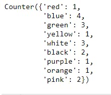
5 color_count=Counter(color)# generates a dictionary with values as the frequency of occurrence of each value and keys as each item in the list
6 print(color_count)
7    gender=["male","female","male","male","male","female",
8   "female","male","male","female","male","male",
9    "male","male","female","female","female","female"]
10    gender_count=Counter(gender)
11    print(gender_count)

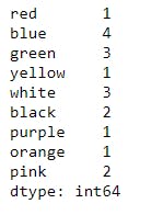
However , these results are in the forms of hash maps and can be expressed in terms of a frequency table using pandas , as shown below
12    import pandas as pd
13    df_colors=pd.DataFrame(color_count)
14    print(df_colors)
And same can be done for gender: This is left as an exercise for the reader
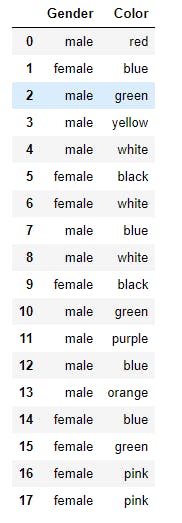
Another method that can be used to obtain the frequency distributions is to obtain the DataFrame for the gender and colors, then use the .value_count() method to obtain the individual frequency distributions, as shown below
14    df=pd.DataFrame({"Gender":gender,"Color":color})
15    print(df)
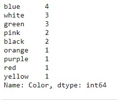
And to obtain the frequency distribution for the colors , we have the following
16 print(df.Gender.value_counts())
The above tables are frequency distribution table for categorical data, which of course can be used for numerical data. However, what if we have the ages of individuals, and one needs to group then. This leads to another type of table, called the grouped frequency distribution table.
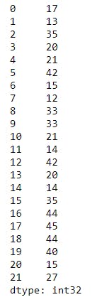
Let's consider the ages of 22 individuals and let the ages be randomly generated using NumPy, between 12 and 45, as shown below
1    import numpy as np
2    import pandas as pd
3    np.random.seed(4)
4    ages=np.random.randint(12,46,22) # Randomly generates integers between 12 and 45
5    df_ages=pd.Series(ages) # converts the ages to a pandas Series object
6    print(df_ages)
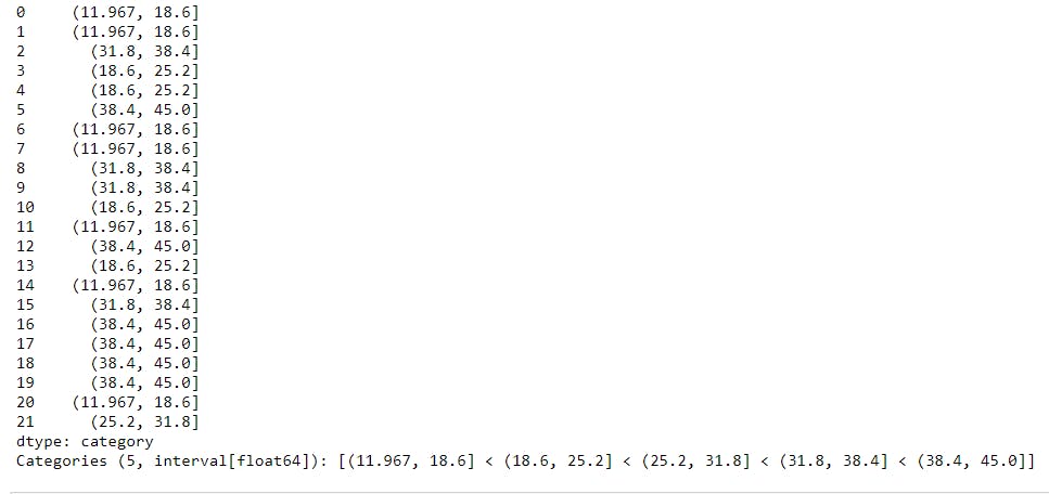
In a group frequency distribution, we express data items in groups, also called intervals or bins. Usually bins are semi-open intervals , that is, they are of the form (a,b], where the ( indicates that a is not part of the interval and ] indicates that b is part of the interval, also a<b. A good example is (12,20], which is the collection of all values between 12 and 20 but 12 not being part of the interval and 20 being the largest possible value of the interval. Other kind of intervals can also be used.
To generate age groups for the data above , we can use the .cut() method in pandas, which takes in a NumPy array or a pandas Series object as the first argument, then the number of bins or intervals of bins as the second arguments, then categorizes each value in its bins or interval, as shown below
7 raw_categories= pd.cut( df_ages,5)
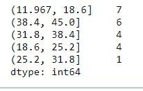
The result above shows the bin where each value lies, however our interest is to determine how many values lies in a given bin, hence we can use the .value_count() method to achieve this , as shown below
8    df_bins=raw_categories.value_counts()
9    print(df_bins)
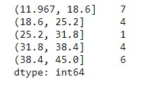
Notice that the intervals or bins are the indices of the Pandas Series, but they aren't ordered. This can be taken care of using the .sort_index() method in pandas , as shown below
10   df_bins_sorted=df_bins.sort_index()
11    print(df_bins_sorted)
Most times we might not want pandas to compute the bin intervals for us, rather use what we have at heart, to do this, we need to specify the bins using the .IntervalIndex.from_tuples() method, then pass it as the bins in .cut() method:
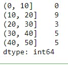
12    bins = pd.IntervalIndex.from_tuples([(0,10),(10,20),(20,30),(30,40),(40,50)])
13    df_with_custom_bins=pd.cut(df_ages,bins).value_counts().sort_index()
Contingency Table
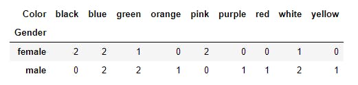
Another ways in which we can represent data is by the use of contingency table. This is especially true for categorical data. Contingency tables are also called cross tabulation tables for good reasons. Contingency tables can be used to keep track of records that falls in two overlapping groups or categories. For instance , using our data set on gender and favorite colors, one may want to know how many men likes a particular kind of color; to do this we have to use a cross tabulation table . A cross tabulation table makes the statistics to be easily captured.
The method to be used in pandas is the .crosstab() method, as shown below
14    contingency_table=pd.crosstab(df.Gender,df.Color)# The first argument get placed as the index and the other get placed as the columns
15    print(contingency_table)
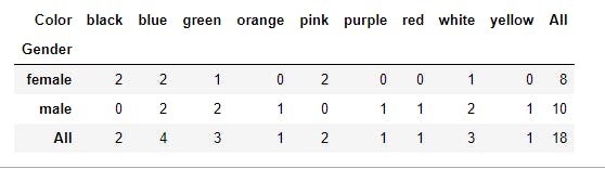
To obtain the marginal sums along each row and column, we can specify the set margins=True, as shown below
16    contingency_table=pd.crosstab(df.Gender,df.Color,margins=True)# The first argument get placed as the index and the other get placed as the columns
17    print(contingency_table)
Cross tabulation tables are generally useful representation of data and are usually used in analysis of frequencies or chi-square tests.
Charts and figures
Charts are the perfect ways to represent data. They are pleasing to the eyes and can tell a thousand stories at one glance(that is when the right tools and graph is used).
There are different kinds of charts and their functionality of purpose.
Bar and Pie charts
Bar charts and pie charts are generally used with categorical data, i.e nominal or ordinal data. This is because they represent non overlapping set of groups.
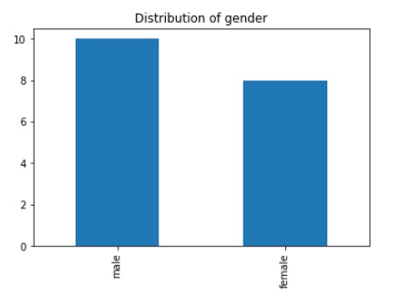
For a horizontal bar chart, the x-axis represents the categories while the y-axis represents the frequency of count or some proportion in terms of frequency.
For instance, we can use pandas to plot a bar chart for the gender and color data set. The code is just one line , as shown below
18 df.Gender.value_counts().plot(kind="bar",title="Distribution of gender")
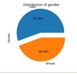
The data set can also be visualized using the pie chart, as shown below
19 df.Gender.value_counts().plot(kind="pie",title="Distribution of gender",explode=(0.2,0),autopct="%.2f%%")
Histogram
The histogram is another type of chart but it is used for continuous data, such as age , weight , e.t.c. To plot a histogram, the data set has to expressed in terms of intervals or bins, then plotting becomes quite easy, however pandas makes the process easy.
The illustration of this is meant for the reader to work on. Use the ages data set generated in this plot post and use 4 bins for this illustration.Hint(Use the .plot() method
Other plots and charts exits, like the area chart, the scatter diagram/chart , the line chart and box plot, however, these shall be discussed in their appropriate sections.
Conclusion
Working with numbers is quite fun when you understand them and how they behave. Statistics brings that fun to reality and when combined with programming, the experience is beyond imagination. Your can analyze and visualize data with a very short amount of time that otherwise would have been impossible. Have a fair grasp of the concept behind data and expect the next my next blog post. Cheers!!
This post is part of a series of blog post on the probability and statistics , based on the course Practical Machine Learning Course from The Port Harcourt School of AI (pmlcourse).