


Hi and welcome
This is the fourth post on my series of post on Data Visualization with Matplotlib, if this is your first read and you're new to matplotlib, do well to read the part I, part II and part III of this series of posts
In this post, we shall be considering
Pie charts and customization
Stack or Area plot
Have a lovely read
Pie chart
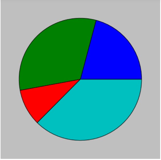
Pie chart , though frowned upon by many data scientist , still have its place in our heart. It is yet one major tool that still serves categorical data well. Let's work on a data set which is based on the daily calories intake of four individuals. The following are the lists for the names and their daily intake; names=["Wilson", "Stanley", "Mimi", "Christian" ] and intakes=[500,768,232,897]. The code for the plot and the plot are shown below:
1    import matplotlib.pyplot as plt
2    names=["Wilson", "Stanley", "Mimi", "Christian" ]
3    intakes=[500,768,232,897]
4    plt.pie(intakes) # Generate the pie chart without labels
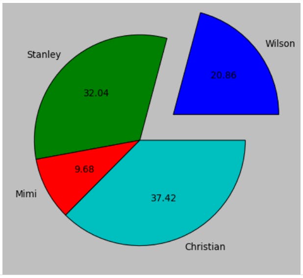
Notice that i used a custom style. Also the plot is without label, since we passed in only the values. In the next plot , i added the labels, then included another property called explode. explode is used to separate a given portion from the rest. It is a tuple, having the same number of entries as the values to be plotted. Each value ranges between 0 and 1, where 1 is the highest separation possible.
1    import matplotlib.pyplot as plt
2    names=["Wilson", "Stanley", "Mimi", "Christian" ]
3    intakes=[500,768,232,897]
4    plt.pie(intakes,labels=names, explode=(0.4,0,0,0)) # Generate the pie chart without labels
In the graph , explode=(0.4,0,0,0) means explode the first entry , which is that for Wilson, hence the separation.
Another property of the pie chart is to include the percentage that each portion occupies. This is done using the autpct property. In the chart below, we have it to be 2 places of decimals, hence *
1    import matplotlib.pyplot as plt
2    names=["Wilson", "Stanley", "Mimi", "Christian" ]
3    intakes=[500,768,232,897]
4    plt.pie(intakes,labels=names, explode=(0.4,0,0,0), autopct='%.2f') # Generate the pie chart without labels
There are other properties of the pie chart that can be experimented on . Next , let's see a generalization to the pie chart , the stack plot
Stack or Area Plot
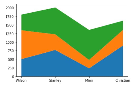
The Stack or Area plot is used for observations over time or period. The plots below are generalization of the calories intake problem. The individuals' calories intake are studied for a period of three days. The Area plot shows the total contribution and individual contributions.
The plot below is without legend or labels .
1    import matplotlib.pyplot as plt
2    names=["Wilson", "Stanley", "Mimi", "Christian" ]
3    intakes_day1=[500,768,232,897]
4    intakes_day2=[843, 456, 245, 456]
5    intakes_day3=[456, 784, 876, 268]
6    plt.stackplot(names, intakes_day1, intakes_day2, intakes_day3)
1 import matplotlib.pyplot as plt
2 names=["Wilson", "Stanley", "Mimi", "Christian" ]
3 intakes_day1=[500,768,232,897]
4 intakes_day2=[843, 456, 245, 456]
5 intakes_day3=[456, 784, 876, 268]
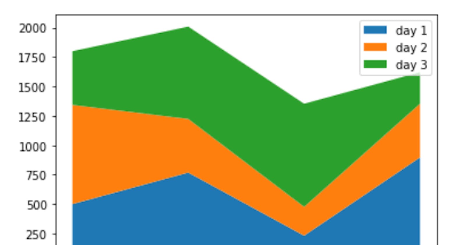
6 plt.stackplot(names, intakes_day1, intakes_day2, intakes_day3,labels=["day 1", "day 2","day 3"])
7 plt.legend()
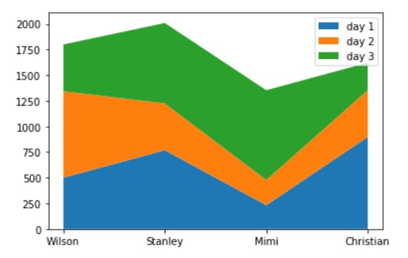
The graph above shows how the labels and legends can be included in the graph. The graph makes it obvious that Stanley is with the largest intake and Mimi is with the least intake, while on day one , Christian has the largest intake.
Conclusion
This post focused on the pie chart and the stack plot. As can be seen , the stack plot can be very useful in periodic observations, e.t.c. There are lot more to be experimented.
This post is part of a series of blog post on the Matplotlib library , based on the course Practical Machine Learning Course from The Port Harcourt School of AI (pmlcourse).