


Hi and welcome
This is the third post on my series of post on Data Visualization with Matplotlib, if this is your first read and you're new to matplotlib , do well to read the Part I and part II of this series of posts
In this post , we shall be considering different
- How to control the location of the legend on your graph
- Customization of the ticks and their orientations on the axes
- How to utilize the inbuilt custom styles of pyplot package
Have a lovely read
Placing the legend
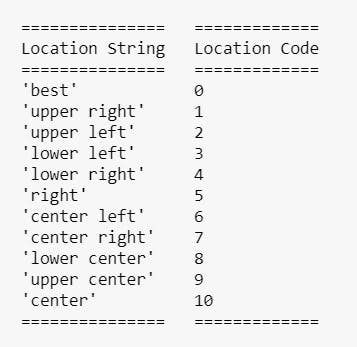
The legend by default looks for the best possible location and sit, however we can specify a location we want using the loc argument of the legend. The possible values of the loc are can be in terms of strings or corresponding codes. The values are
Below are illustration of these concepts
1    import matplotlib.pyplot as plt
2    import numpy as np
3    x=np.linspace(-10,10,1000)
4    sin=np.sin(x)
5    cos=np.cos(x)
6    plt.plot(x,sin,label="Sine")
7    plt.plot(x,cos,label="Cosin")
8    plt.legend()
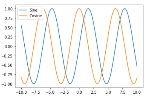
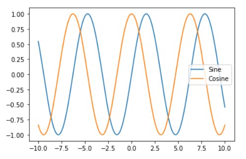
In the plot above , the best location was used , which is the default case of the loc parameter. Coincidentally , the best location happened to be the upper left.
1    import matplotlib.pyplot as plt
2    import numpy as np
3    x=np.linspace(-10,10,1000)
4    sin=np.sin(x)
5    cos=np.cos(x)
6    plt.plot(x,sin,label="Sine")
7    plt.plot(x,cos,label="Cosine")
8    plt.legend(loc="lower right")
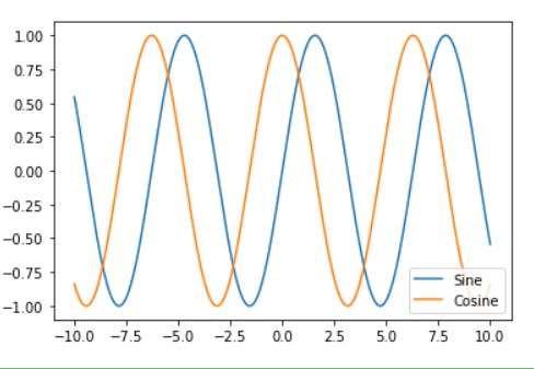
In the graph above, a string is used to specify the location.
1 import matplotlib.pyplot as plt
2 import numpy as np
3 x=np.linspace(-10,10,1000)
4 sin=np.sin(x)
5 cos=np.cos(x)
6 plt.plot(x,sin,label="Sine")
7 plt.plot(x,cos,label="Cosine")
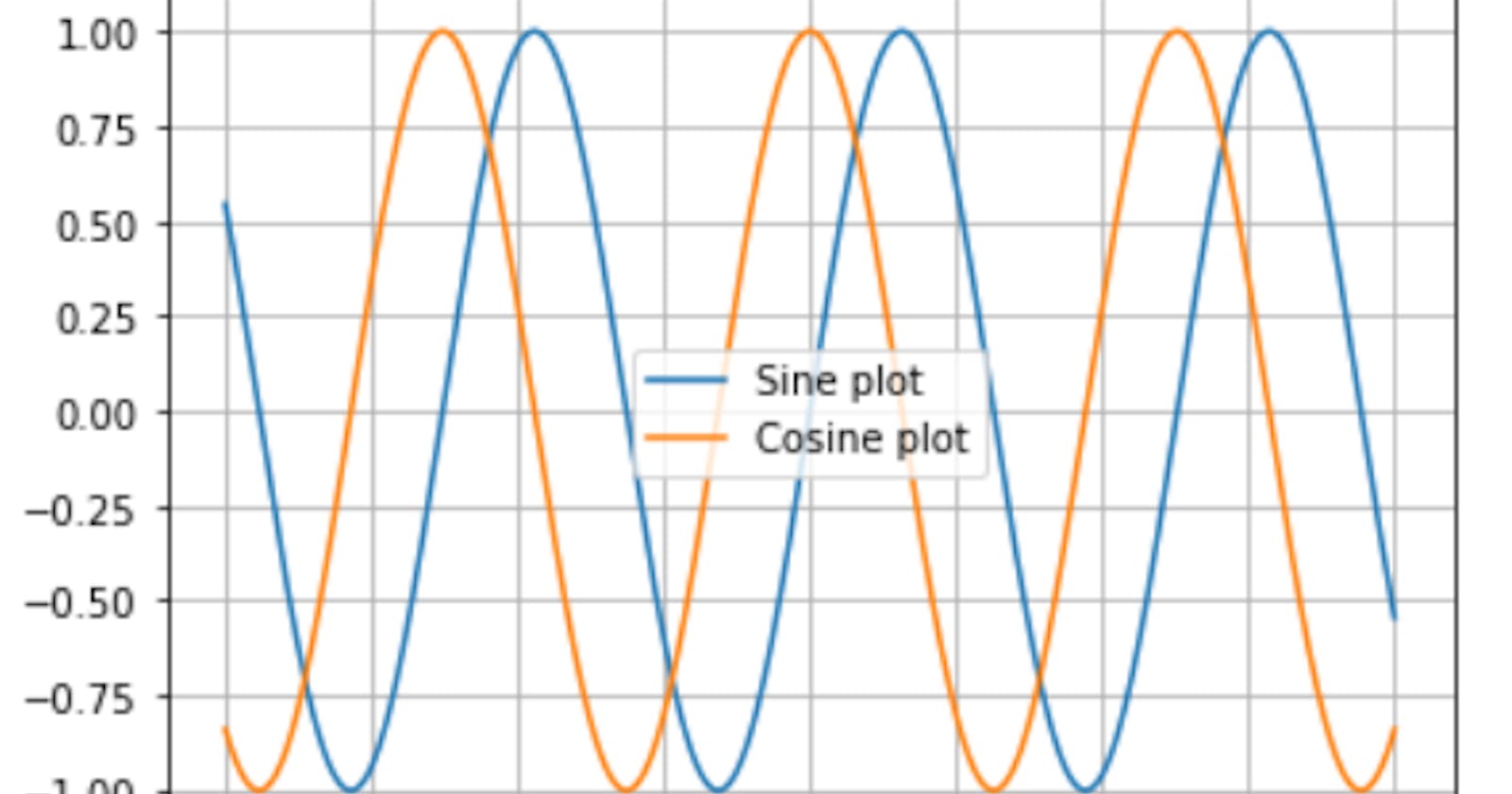
8 plt.legend(loc=7)
In the plot above , an integer is used to specify the location.
Customizing the ticks
The ticks are the values that appear on the axes. We can take control of what appears by using the .xticks() and .yticks() methods.
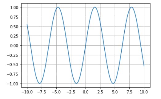
Below is the plot the sine graph without specifying the ticks that appears
1    import matplotlib.pyplot as plt
2    import numpy as np
3    x=np.linspace(-10,10,1000)
4    sin=np.sin(x)
5    cos=np.cos(x)
6    plt.plot(x,sin,label="Sine")
7    plt.grid(True)
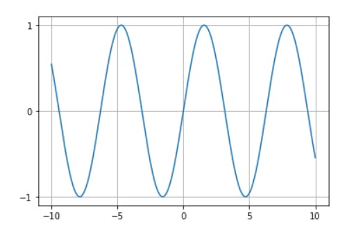
In the graph below, only five points appear on the x axis and three on the y axis because we specified so.
1    import matplotlib.pyplot as plt
2    import numpy as np
3    x=np.linspace(-10,10,1000)
4    sin=np.sin(x)
5    cos=np.cos(x)
6    plt.plot(x,sin,label="Sine")
7    plt.xticks([-10,-5,0,5,10])# specifies ticks on the x-axis
8    plt.yticks([-1,0,1])# specifies ticks on the y-axis
9    plt.grid(True)
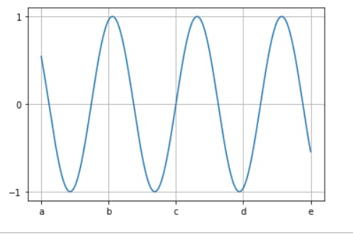
The labels appearing on can also be replaced using a second list of values called the labels , as shown below
1 import matplotlib.pyplot as plt
2 import numpy as np
3 x=np.linspace(-10,10,1000)
4 sin=np.sin(x)
5 cos=np.cos(x)
6 plt.plot(x,sin,label="Sine")
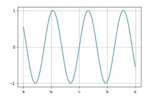
7 plt.xticks([-10,-5,0,5,10],["a","b","c","d","e"])# specifies ticks on the x-axis
8 plt.yticks([-1,0,1])# specifies ticks on the y-axis
9 plt.grid(True)
The orientation of these values can also be changed , using the rotation parameter, as shown below
1    import matplotlib.pyplot as plt
2    import numpy as np
3    x=np.linspace(-10,10,1000)
4    sin=np.sin(x)
5    cos=np.cos(x)
6    plt.plot(x,sin,label="Sine")
7    plt.xticks([-10,-5,0,5,10],["a","b","c","d","e"],rotation=45)#rotates the ticsks to an angle of 45 degrees
8    plt.yticks([-1,0,1])# specifies ticks on the y-axis
9    plt.grid(True)
Using the inbuilt custom styles of pyplot
Pyplot comes with a use set of custom styling which helps to improve the appearance of our graph/plots . There are different styles, each which a name. To see the lists of available styles, we can use the .style.available attribute , as shown below
1    print(plt.style.available)
"""
The output is
['bmh', 'classic', 'dark_background', 'fast', 'fivethirtyeight', 'ggplot', 'grayscale',
 'seaborn-bright', 'seaborn-colorblind', 'seaborn-dark-palette', 'seaborn-dark',
'seaborn-darkgrid', 'seaborn-deep', 'seaborn-muted', 'seaborn-notebook',
'seaborn-paper', 'seaborn-pastel', 'seaborn-poster', 'seaborn-talk',
 'seaborn-ticks', 'seaborn-white', 'seaborn-whitegrid', 'seaborn', 'Solarize_Light2',
'tableau-colorblind10', '_classic_test']
"""
To use any of these styles , we pass it in as the argument of the .style.use() method, as shown below
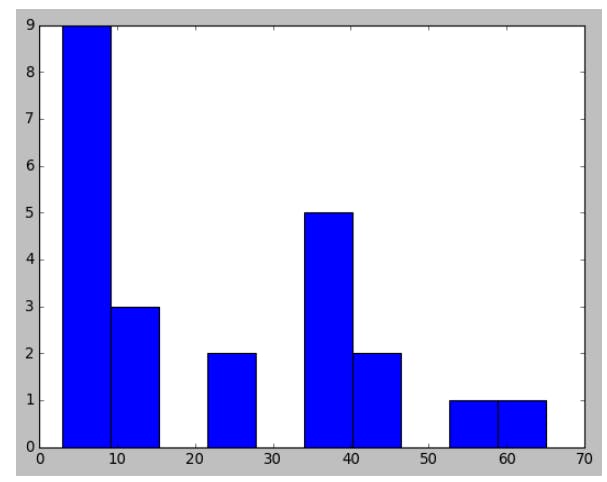
1 plt.hist([12,34,42,56,23,65,12,34,5,4,34,5,44,34,3,4,6,5,4,3,12,34,23])
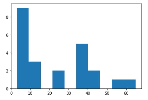
Above is a plot without specifying any style
In the graphs below , three of the available styles are used
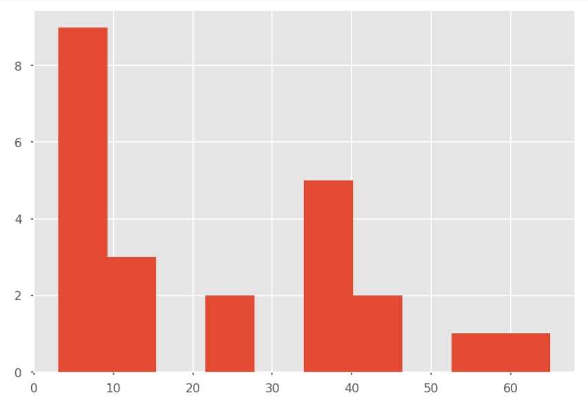
1    plt.style.use("ggplot")
2    plt.hist([12,34,42,56,23,65,12,34,5,4,34,5,44,34,3,4,6,5,4,3,12,34,23])
The result is
1    plt.style.use('seaborn-dark-palette')
2    plt.hist([12,34,42,56,23,65,12,34,5,4,34,5,44,34,3,4,6,5,4,3,12,34,23])
The result is
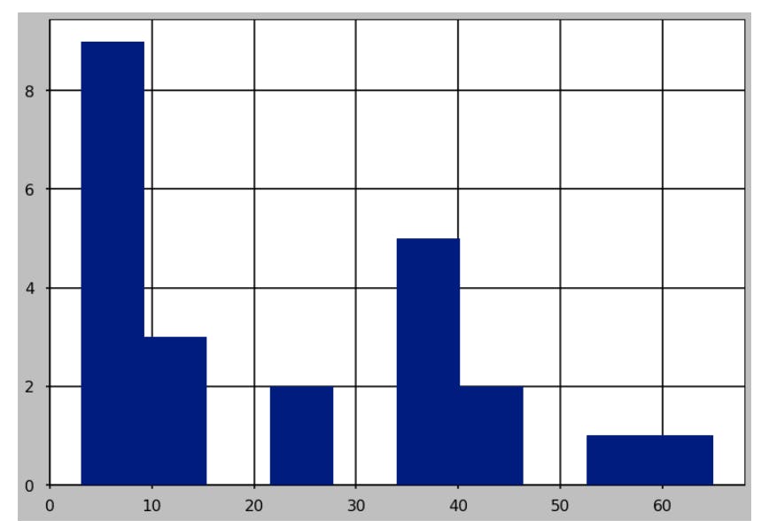
1    plt.style.use('classic')
2    plt.hist([12,34,42,56,23,65,12,34,5,4,34,5,44,34,3,4,6,5,4,3,12,34,23])
The result is
Play around with other styles on other plots and see the difference.
Conclusion
Having fun , right? Stick around and see more customization and plots types in the posts to come.
This post is part of a series of blog post on the Matplotlib library , based on the course Practical Machine Learning Course from The Port Harcourt School of AI (pmlcourse).