


Hi and welcome
In the last post, Data Visualization with Matplotlib I, we introduced the concept of Matplotlib and different kinds of plots and charts. In this post , we shall be considering some other charts and styling.
Histogram
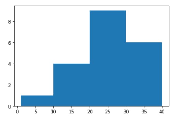
The histogram is used on continuous data that could be grouped or expressed in terms of groups. For instance , ages of individuals can be expressed in terms of intervals , which is seen as groups. These groups are also called bins. Matplotlib is designed in such a way that when the number of bins or the limits of the bins are not given , it uses a default of 10 bins.
1    import numpy as np
2    import matplotlib.pyplot as pl
3    #The magic function below is to be used only on jupyter notebook or jupyterlab
4    %matplotlib inline
5    np.random.seed(20)
6    ages=np.random.randint(1,40,20) #
7    plt.hist(ages)
8    plt.show() # not necessary in jupyterlab or notebook
The output is
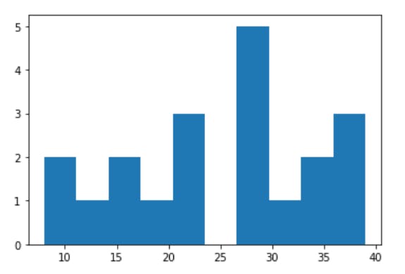
We can specify the number of bins we need
1    import numpy as np
2    import matplotlib.pyplot as pl
3    np.random.seed(20)
4    ages=np.random.randint(1,40,20) #
5    plt.hist(ages,bins=4)
6    plt.show()
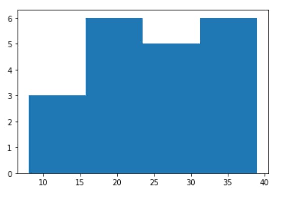
We can also specify the boundaries of each interval , as shown below
1    import numpy as np
2    import matplotlib.pyplot as pl
3    np.random.seed(20)
4    ages=np.random.randint(1,40,20) #
5    plt.hist(ages,bins=[1,10,20,30,40])
6    plt.show()
bins=[1,10,20,30,40], simply means the first interval is 1-10, the second is 10-20 and so on.
Now , before we consider some other charts , let's see our we can customize our charts to look better and more presentable.
Styling
To style a chart , so many things can be changed or added, like colors, axes titles and labels and graph title. Legends can be added , especially if we have so many components on the same graph. We can include annotations , and so on. Enough talking , let's get to action by starting some where.
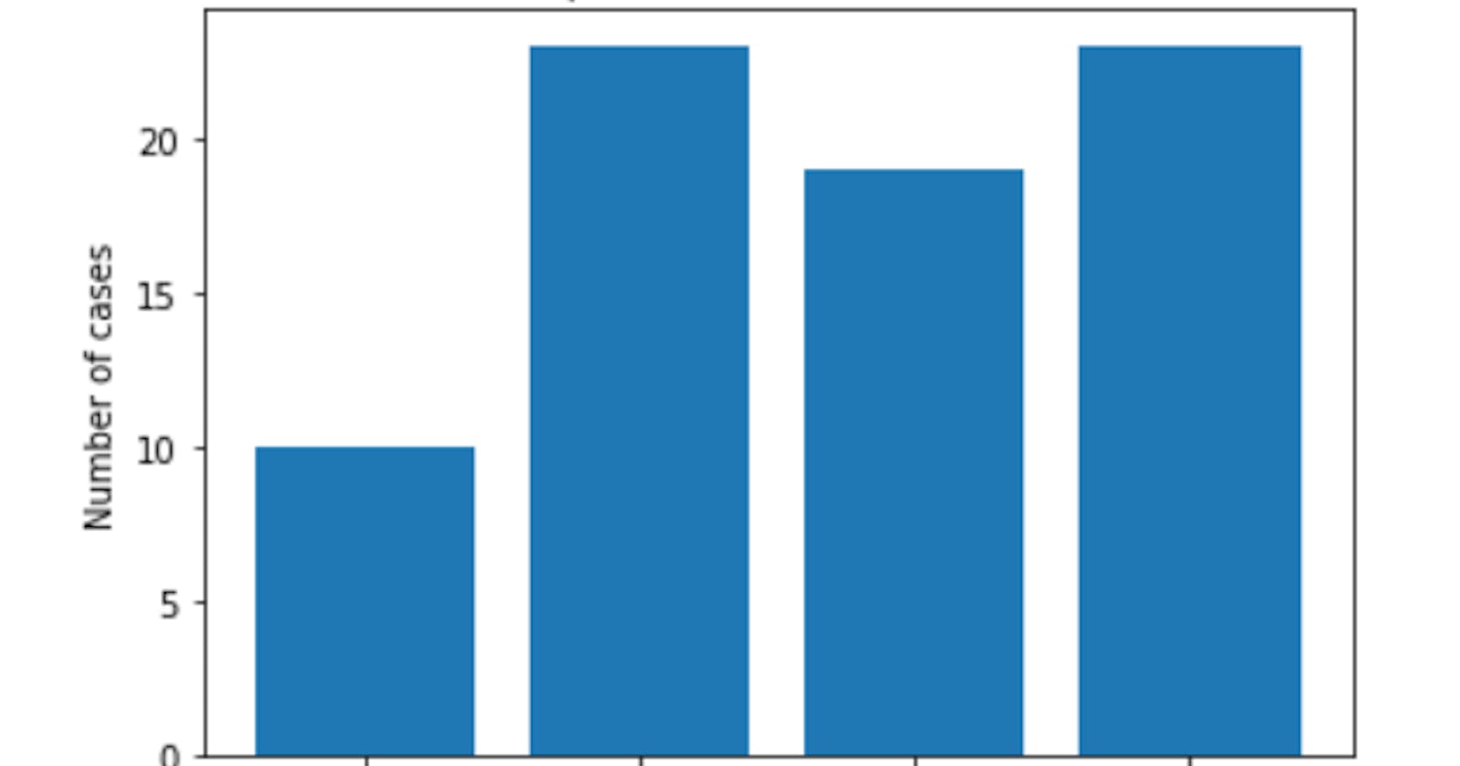
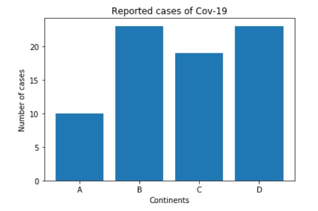
##Graph and axes title To illustrate this , let's consider a bar chart which shows the reported cases of corona virus.
1    import numpy as np
2    import matplotlib.pyplot as plt
3    continents =["A","B","C","D"]
4    cases =[10,23,19,23]
5    plt.bar(continents ,cases )
6    plt.title("Reported cases of Cov-19")# This takes care of the graph title
7    plt.xlabel("Continents")# The title on the x- axis
8    plt.ylabel("Number of cases") # The title on the y-axis
This is as shown
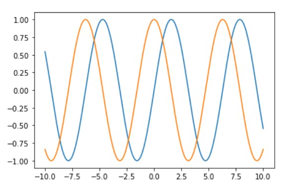
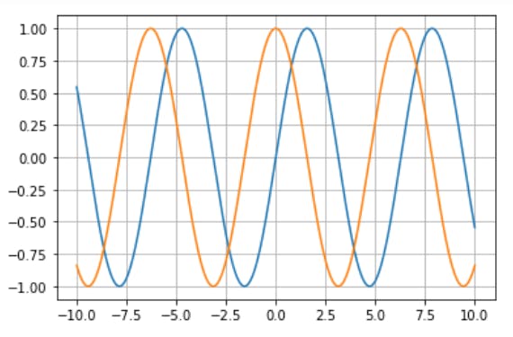
Legend and grid Grid lines are lines parallel to the axes. They run at regular intervals. By default, the grid lines are turned off. To turn them on or make them visible, we use the. grid() method, which takes in the state of the grid as it's argument. The default case is False , hence we need to change it to be true, this is as shown in the graph below, which also illustrates how two graphs can be plotted in one figure.
Without grid
1    x=np.linspace(-10,10,1000)
2    sine=np.sin(x)
3    cosine=np.cos(x)
4    plt. plot(x, sine)
5    plt. plot(x,cosine)
With grid
1    x=np.linspace(-10,10,1000)
2    sine=np.sin(x)
3    cosine=np.cos(x)
4    plt. plot(x, sine)
5    plt. plot(x,cosine)
6    plt. grid(True) # This turns on the grid system
Notice that we have two graphs on the same figure and though they have different colours but we can't tell which is for sine and which is for cosine, hence we need a legend to distinguish between the two.
There are different ways to include legends. We can use the. legend() method, then pass in labels for each plot, in the order we want them. For instance, in the graph above, the sine graph comes before the cosine graph, hence we need to include the label for the sine graph before the cosine graph as shown below.
1    import numpy as np
2    x=np.linspace(-10,10,1000)
3    sine=np.sin(x)
4    cosine=np.cos(x)
5    plt. plot(x, sine)
6    plt. plot(x,cosine)
7    plt. grid(True)
8    plt.legend(["Sine plot", "Cosine plot"])
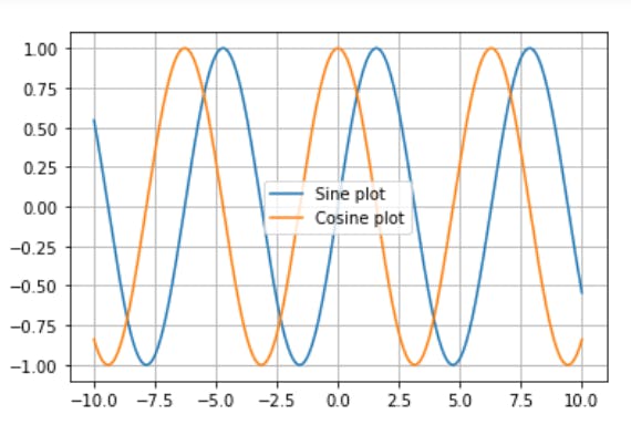
The above method is not a good one, because if for some reason, we change the order of the graphs, then we would have to change the order of the labels in the .legend So, we can use another method, in which we include the labels of each plot in the plot, then just call the .legend() method with no argument. The labels would be taken automatically from the graphs in the order in which they appear. So even if we include a new graph or change the order of the graphs, we need not worry since every thing would be ordered.
1    import numpy as np
2    x=np.linspace(-10,10,1000)
3    sine=np.sin(x)
4    cosine=np.cos(x)
5    plt. plot(x, sine,label="Sine plot")
6    plt. plot(x,cosine,label="Cosine plot")
7    plt. grid(True)
8    plt.legend()
Conclusion
From the sessions above, it is obvious that styling with matplotlib is simple. There are more styling options available. In the next post , we shall look at these styling options and how we can utilize them in other advanced plots.
So, have a nice practice section.
See you in the next post.
This post is part of a series of blog post on the Matplotlib library , based on the course Practical Machine Learning Course from The Port Harcourt School of AI (pmlcourse).