


Hi and welcome
In this post we shall get our hands dirty by learning our to visualize data with the most popular python data visualization library (Matplotlib). This is the first post of a series of blog post on Data Visualization with Matplotlib To follow up on this , a good knowledge of the numpy library is required. You can brush up with my series on the NumPy library.
 Photo by Adeolu Eletu on Unsplash
Matplotlib is the primary library/package in python for data visualization. It is rich in methods/functions for plotting 2 and 3 dimensional graphs. It can also be used for contour plots and animation. Like other libraries, before one can make use of this library , it has to be installed , then import to the IDE being used. If you're working with anaconda distribution , it comes prepackaged with matplotlib, otherwise it can be installed using the command line or terminal by using the the command below
Note that you have to be connected to the internet.
Now that we have Matplotlib on our systems, we need to import the library , then make use of it. The methods that will be used lies in a module called pyplot in the matplotlib package , hence we import using the code below
1 import matplotlib.pyplot as plt #The plt is just a convention being used
another common way this can be done is
1 from matplotlib import pyplot as plt
Matplotlib has different methods for different kinds of plot. In this post we shall be looking into the following
- plot
- scatter diagram
- bar and barh charts
Plots
The plot function, connects the points in the graph in the order in which they are plotted on the graph.
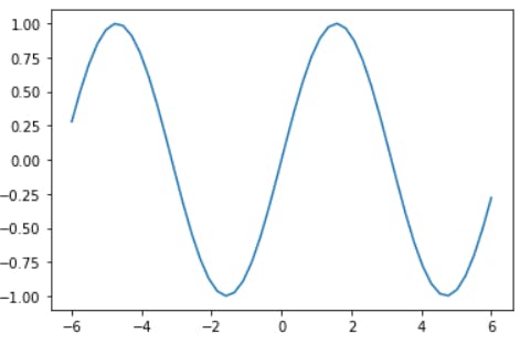
Now, Matplotlib works very well with NumPy , hence in most examples we shall be generating data with NumPy . To illustrate how this method works, i will use some fundamental functions in science , namely the sine , cosine, tangent and the sigmoid functions
Sine graph
A data set of 50 numbers from -6 to 6 are generated using the .linspace() method, then the plot method is used to visualize the result, after applying the universal functions.
1    from matplotlib import pyplot as plt
2    import numpy as np
3    x= np.linspace(-6,6,50)# generates an Arithmetic progression with 50 terms , having the first and last terms as -6 and 6 respectively
4    sine_values =np.sin(x)
5    plt.plot(x,sine_values) # The first argument is for the x-axis and the second is for the y-axis.
6    plt.show()# this makes the graph to apeear. Which is not needed in jupyter notebook
The output is
In the code above , if your IDE is jupyter notebook or jupyter lab , then the .show() method is not needed, rather there is a jupyter notebook magic function that can be used to make the graph appear inline. Note that the magic function need to be applied once in any of the cells before the first plot. One of such magic function is
1 %matplotlib inline
Cosine graph
1    from matplotlib import pyplot as plt
2    import numpy as np
3    x= np.linspace(-6,6,50)
4    cosine_values =np.cos(x)
5    plt.plot(x, cosine_values )
6    plt.show()
The output is
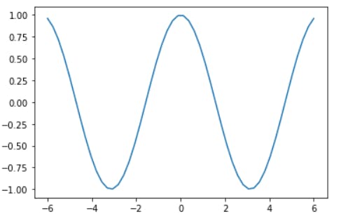
Note the slight difference between the sine and the cosine graph.
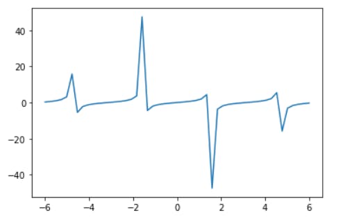
Tangent graph
1    from matplotlib import pyplot as plt
2    import numpy as np
3    x= np.linspace(-6,6,50)#
4    tangent_values =np.tan(x)#
5    plt.plot(x, tangent_values )
6    plt.show()# this makes the graph to apeear. Which is not needed in jupyter notebook
The output is
Sigmoid function
The sigmoid function is of the form 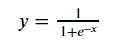 , where x is a value and exp is the exponential function
The graph of the function can be gotten using the code below.
, where x is a value and exp is the exponential function
The graph of the function can be gotten using the code below.
1    from matplotlib import pyplot as plt
2    import numpy as np
3    x=np.linspace(-10,10,1000)# generates 1000 numbers , where the first term is -10 and the last term is 10
4    sigmoid_value =1/(1+np.e**(-x))
5    plt.plot(x, sigmoid_value )
6    plt.show()
The output is
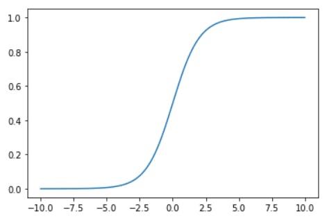
Bar chart
The bar chart is a chart that is used for categorical data. For instance , we have four comapanies A,B,C and D with their average annual revenues. To have a visual representation of this data , which is appealing we can use the bar chart , which is as shown below
1    from matplotlib import pyplot as plt
2    import numpy as np
3    annual_returns =np.random.randint(2,10,4)# randomly generates 4 integers between 2 and 10
4    companies=["A", "B", "C", "D"]
5    plt.bar(companies, annual_returns )
The output is as shown below.
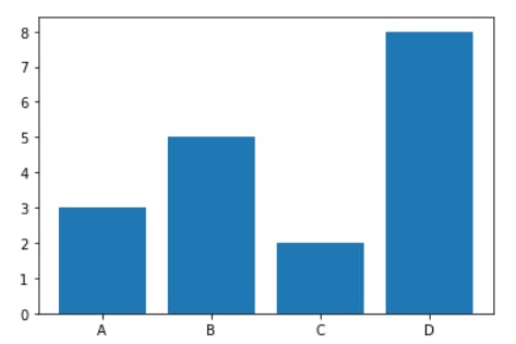
Horizontal Bar chart
This is the bar chart with the categories on the y-axis and there frequencies on the x-axis.
1    from matplotlib import pyplot as plt
2    import numpy as np
3    annual_returns =np.random.randint(2,10,4)#
4    comapnies=["A", "B", "C", "D"]
5    plt.barh(companies, annual_returns )
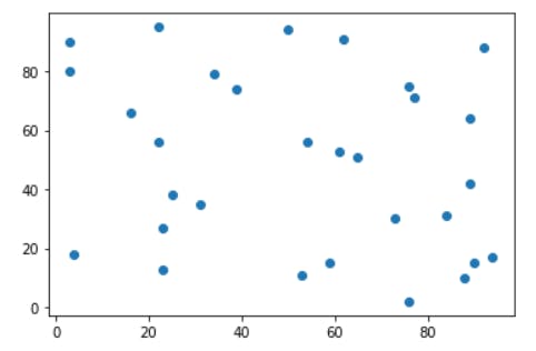
Scatter method
A scatter diagram is used to study the kind of relationship that exists between variables , i.e to determine if they are linearly related , have a quadratic relation , exponential , e.t.c.
The .seed() methods are used to make the random numbers deterministic, that is , my result will be the same as yours.
Below is a graph of a scatter plot , as shown
1    from matplotlib import pyplot as plt
2    import numpy as np
3    np.random.seed(42)
4    x=np.random.randint(2,100,30)
5    np.random.seed(10)
6    y=np.random.randint(2,100,30)
7    #Note that in all graphs plotted , the size of both list must be the same .
8    plt.scatter(x,y)
9    plt.show()
The output is
Conclusion
As can be seen , using matplotlib for data visualization is fun and simple. It has a uniform interface and nice formatting properties that can make your graph look stunning. In the part II of this series , i will be treating some other kinds of graphs and different graph formatting options. Hope you enjoyed the read. Do well to practice , practice , practice. See you in the next post. Cheers.
This post is part of a series of blog post on the Matplotlib library , based on the course Practical Machine Learning Course from The Port Harcourt School of AI (pmlcourse).